Content priority by viewport
We decide what users need first on each screen size so important actions never disappear.
Responsive Design
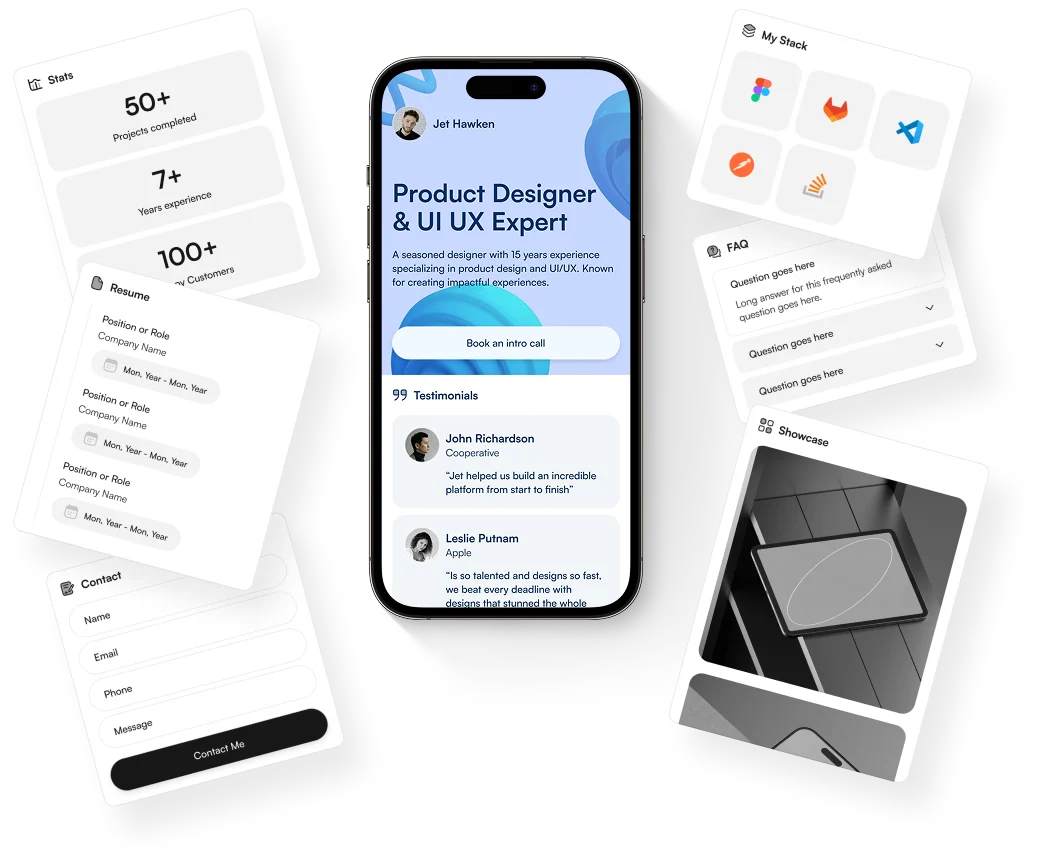
Codetors creates flexible interfaces that keep AI, software, and product content clear, actions visible, and brand quality consistent on every screen.
 AI-ready clarity
Responsive design is not just shrinking a desktop layout. We plan content priority, navigation, spacing, typography, AI feature surfaces, and touch targets so each viewport feels intentionally designed.
Outcomes
Mobile-first layouts with stable spacing, readable type, and accessible controls.
Desktop interfaces that use available space without overwhelming users.
Responsive media, imagery, menus, forms, and conversion components.
Cross-device QA for layout shifts, overflow, and interaction issues.
Approach
We decide what users need first on each screen size so important actions never disappear.
Reusable spacing, grid, and component rules keep pages consistent as new content is added.
Readable contrast, tap-friendly controls, semantic structure, and keyboard-friendly interactions are part of the build.
Process
01
Content audit
02
Mobile layouts
03
Desktop layouts
04
Component rules
05
Device QA
FAQs
Yes. We can audit the layouts, repair overflow and spacing issues, and rebuild fragile components where needed.
Yes. Mobile usability, performance, and content accessibility all influence how well a site can compete in organic search.
 Ready To Build Your AI Advantage?